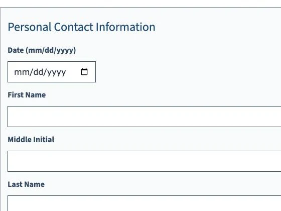
Built-in date input The original
- Native to the browser
- In our sessions, no one could tell the format or get a keyboard response
Why blind screen-reader users get stuck in online job applications, and how I redesigned one to work with a screen reader from start to finish.
Online forms are one of the most common places the web breaks for people who use screen readers. On a job application the cost is high: a field you can’t complete can end the application before anyone reads it.
Our team asked a simple question: what problems do blind and low-vision users face when they fill in digital forms with a screen reader? To find out, we watched four blind adults complete CareerOneStop’s Practice Job Application, a 7-page form from the US Department of Labor, on their own devices.
Each session had a short interview, the observed task over Zoom with screen sharing, and a reflection. We coded the transcripts line by line into themes, and used task analysis and the AEIOU framework on our observation notes.
Four experienced screen-reader users in Chicago, aged 52 to 71.
Every participant was an experienced screen-reader user, and every breakdown we saw came from how the form was built. Three themes explained them.
Finding 1 · Knowing where you are
Focus jumped between sections. The F and H keys skipped information or landed on unlabelled controls, and some keys advanced the page without warning, so people had to stop, re-scan and rebuild their picture of the form.
Finding 2 · Controls that just work
No one could tell the required format, operate the date control reliably from the keyboard, or make sense of what the screen reader said about it. People skipped the field or tried workaround after workaround.
Finding 3 · Clear feedback
The form never said when a required field was missed or an entry was wrong. Participants re-checked every answer by hand and tracked their own progress in their heads.
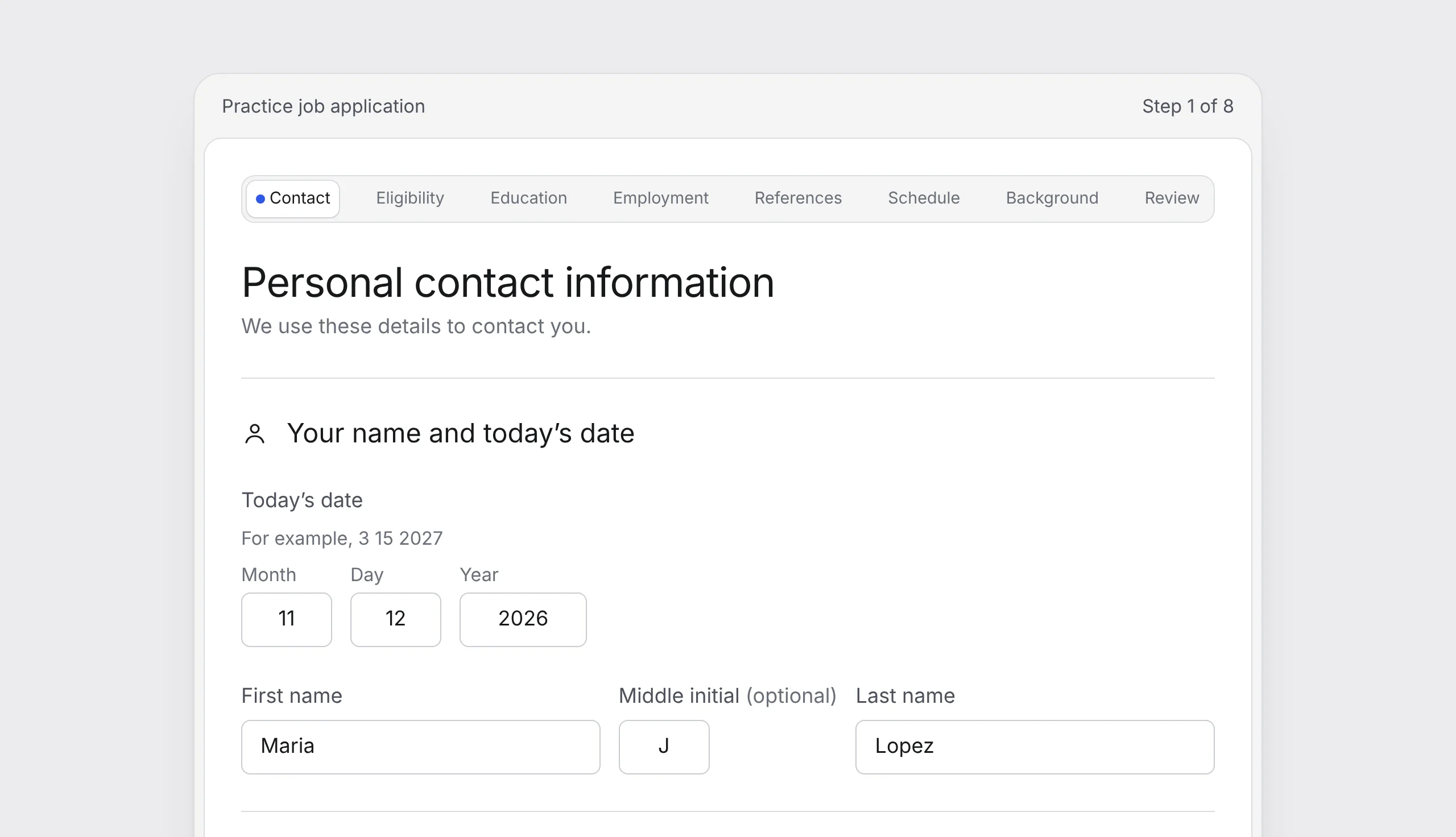
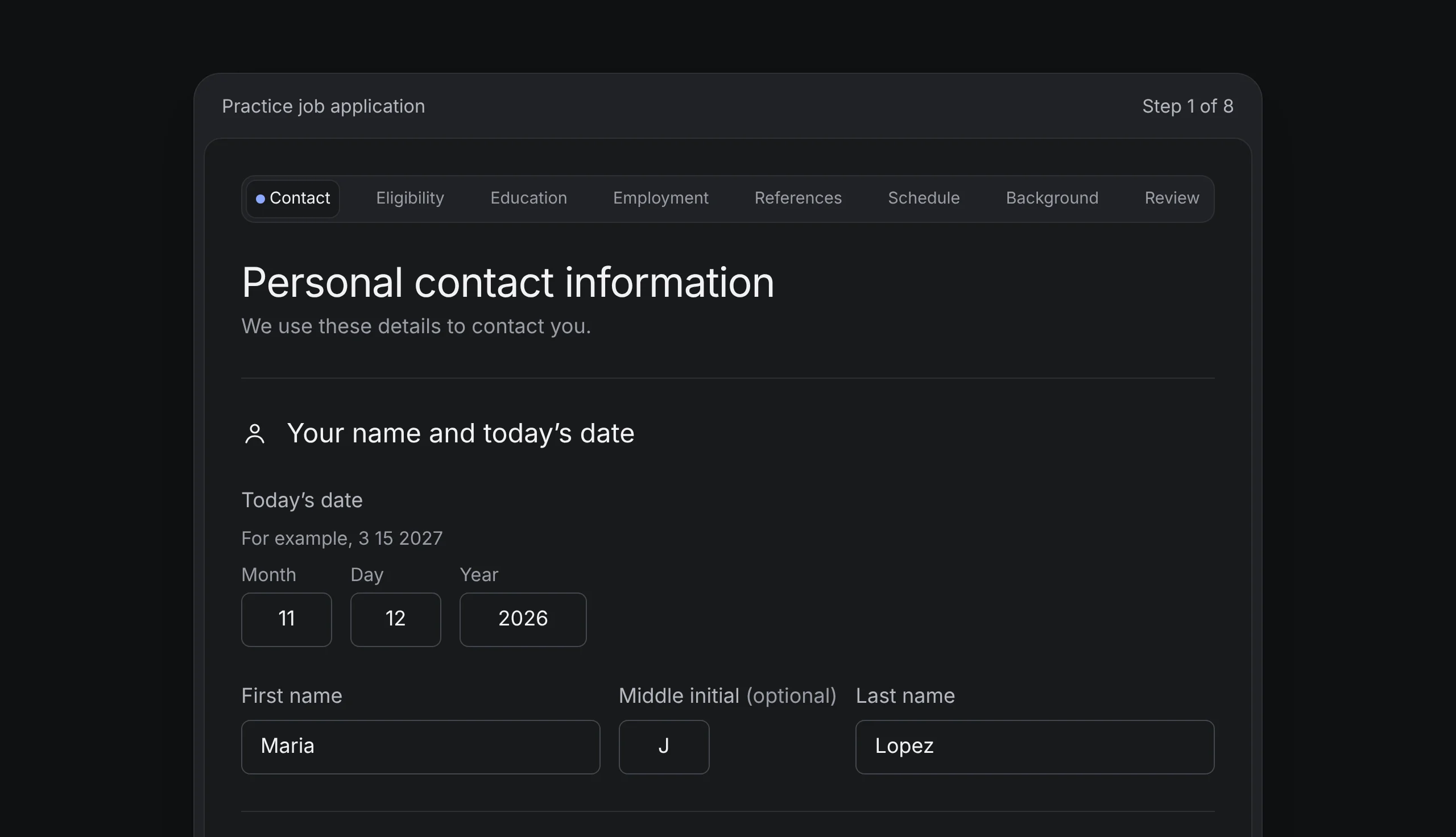
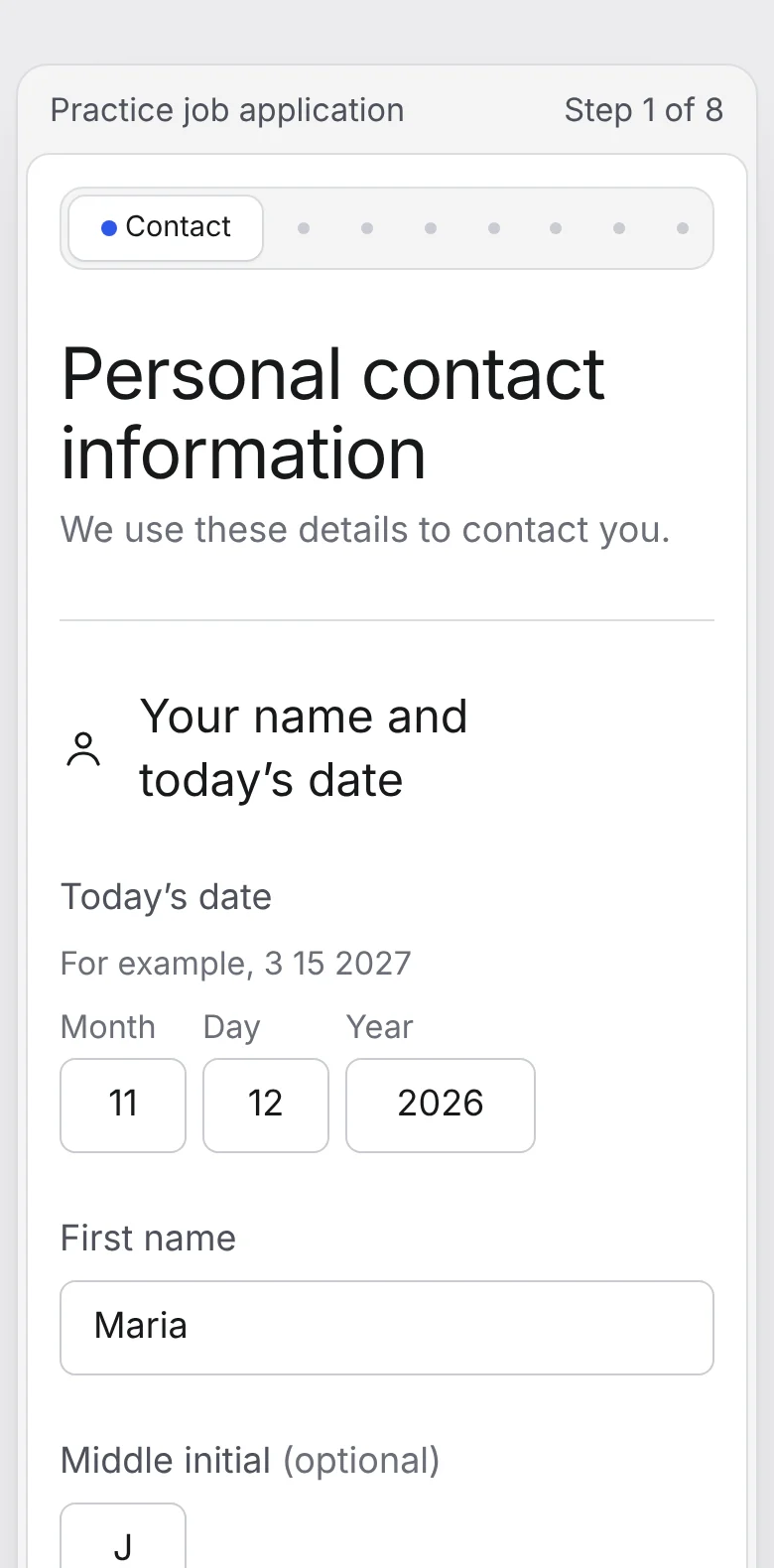
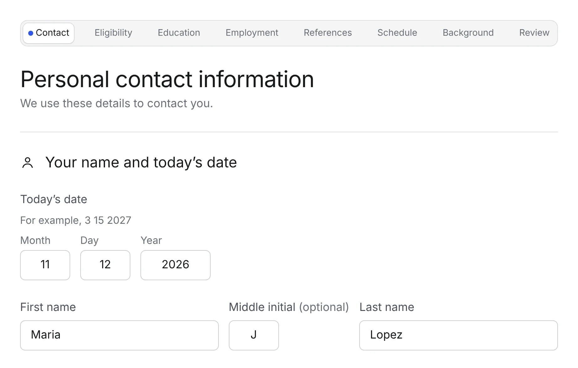
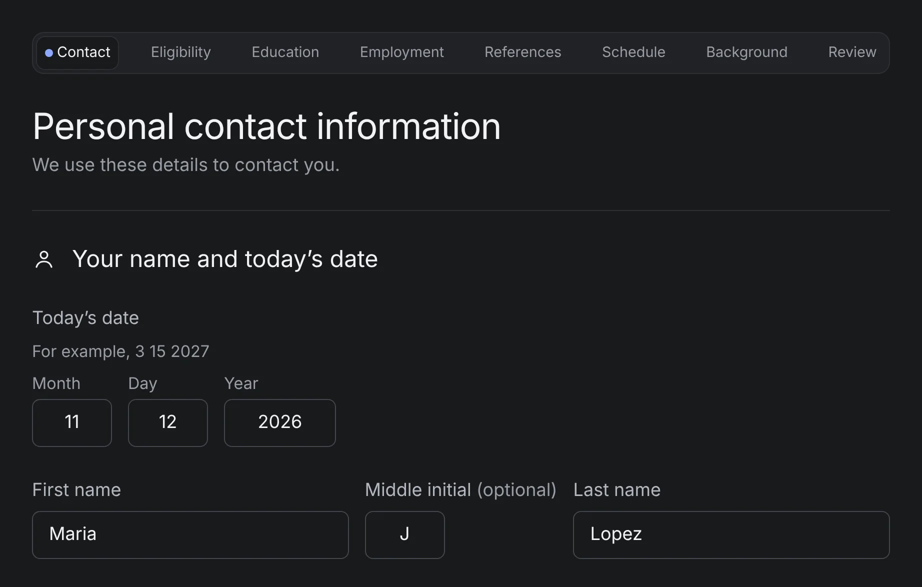
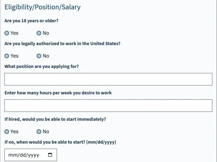
The redesign keeps all seven of the original’s sections and asks the same questions, so each pair below compares the same content.
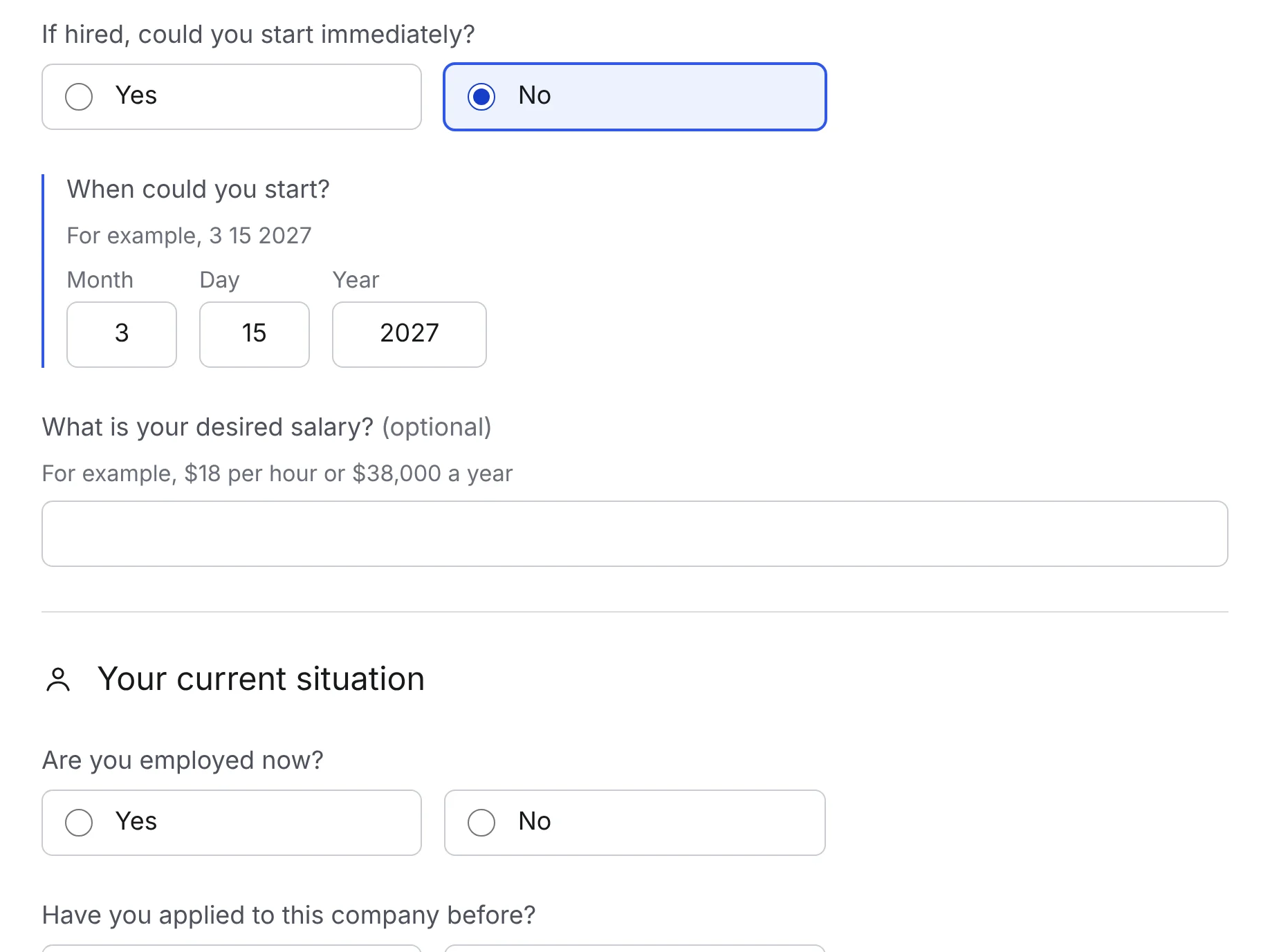
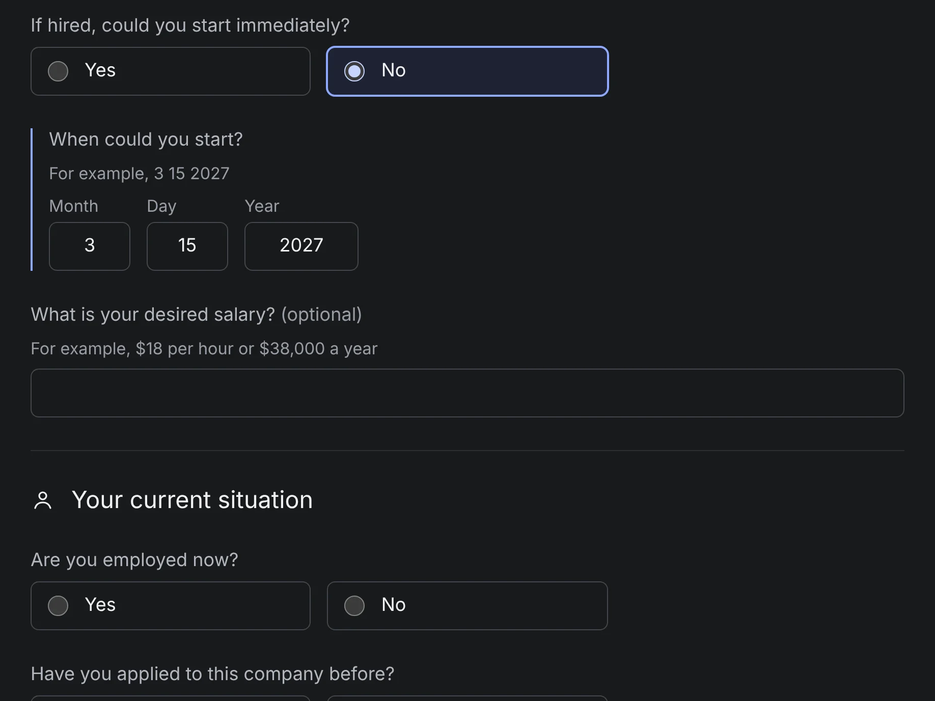
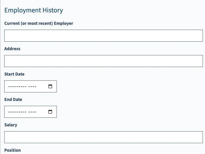
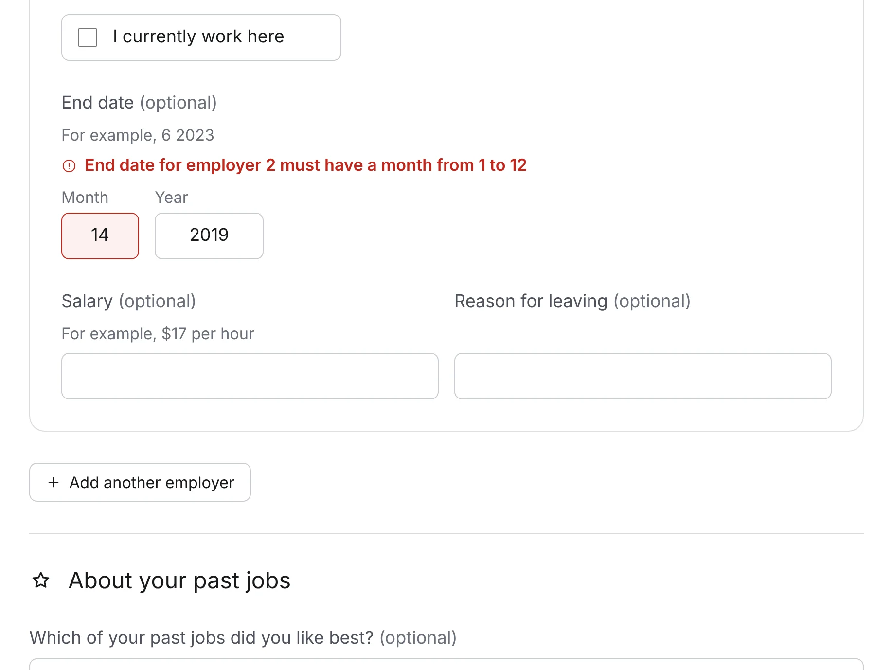
Original screenshots captured from the live CareerOneStop form in November 2026; it may have changed since our 2025 sessions.
The date field was the most severe barrier. The original uses the browser’s own date input, so “use native controls” wasn’t enough on its own. I compared four ways to ask for a date.
Month comes first because all participants were in Chicago. The same pattern replaces the original’s month pickers in employment history.
Each part of the redesign responds to one of the three findings. The numbered notes come from tags in the prototype’s code; hover or focus a note to highlight it on the screen.
Start oriented. The progress bar, page title and heading all say where you are, and every field says what it wants.
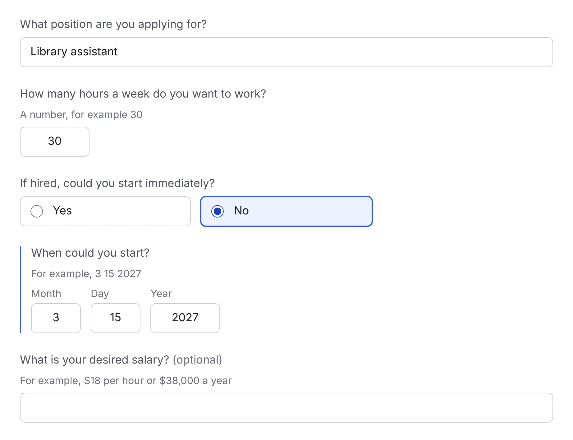
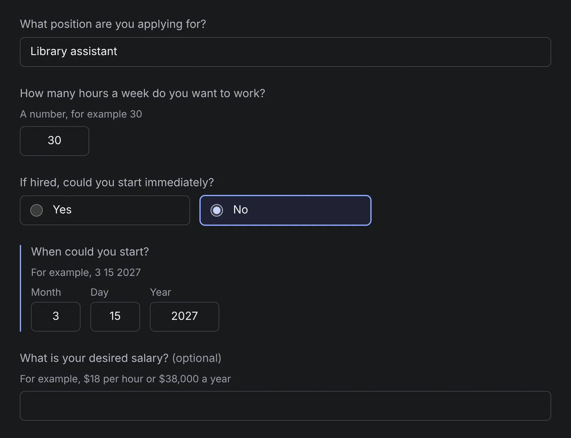
Only the questions that apply. Follow-ups appear after the answer that needs them, in reading order.
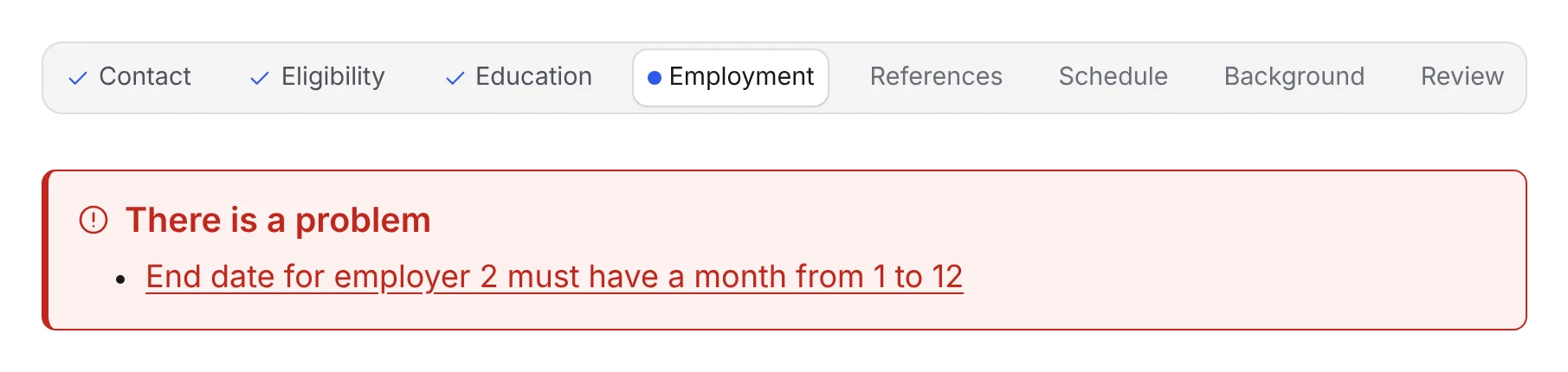
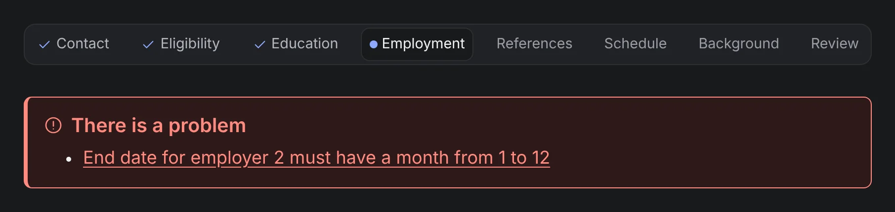
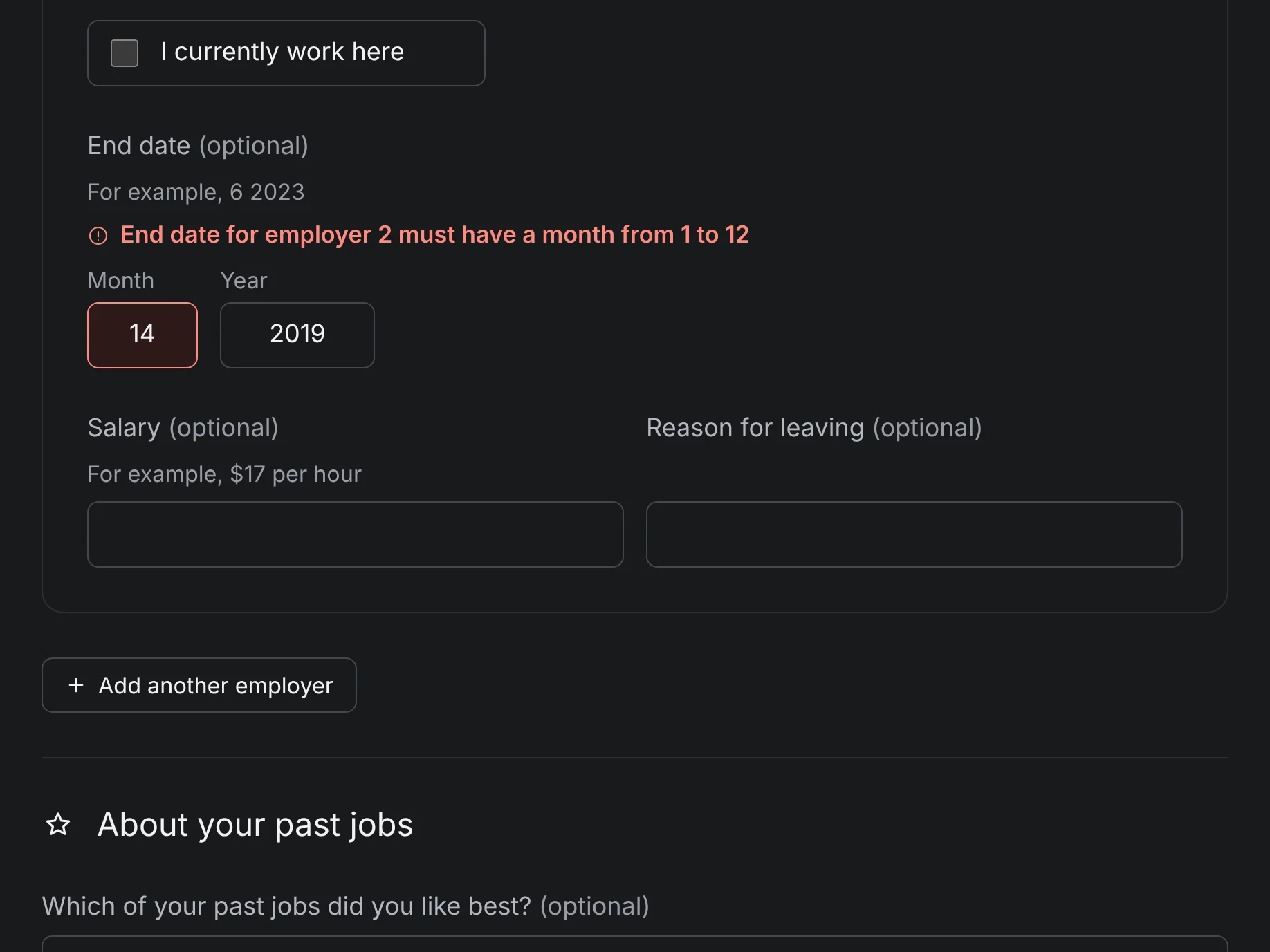
Errors you can find. Focus moves to a summary of everything wrong, and each item links to its field.
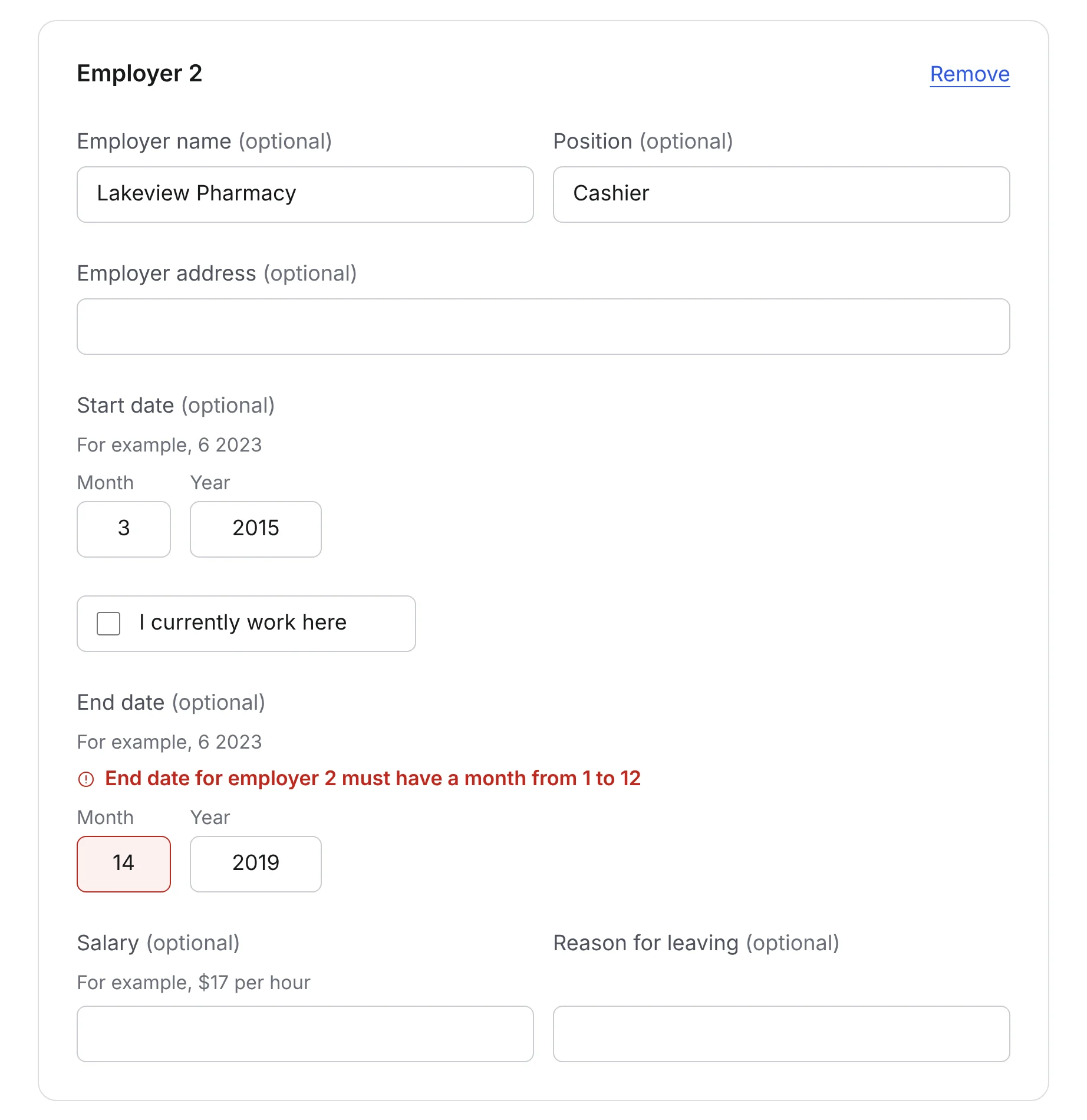
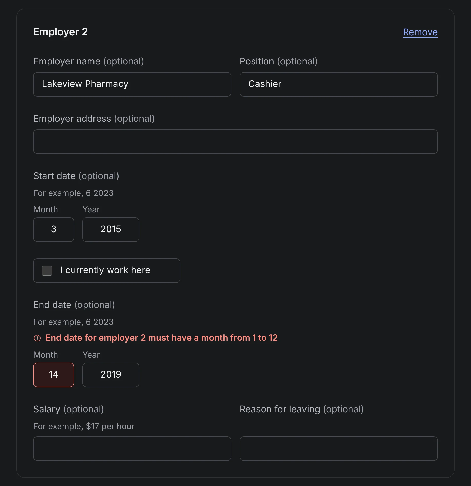
And the fix, in place. The same message sits next to the field, marked invalid for the screen reader.
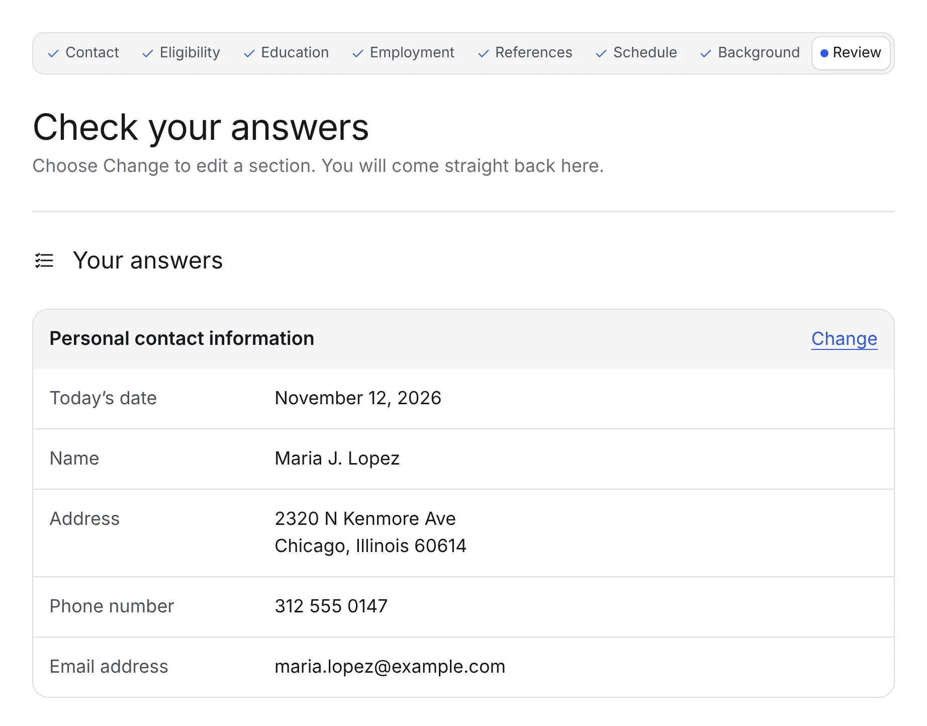
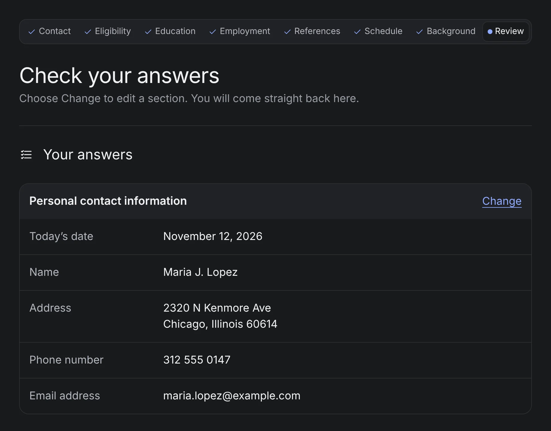
One place to check. People re-checked everything by hand, and the original has no review, so I added one.
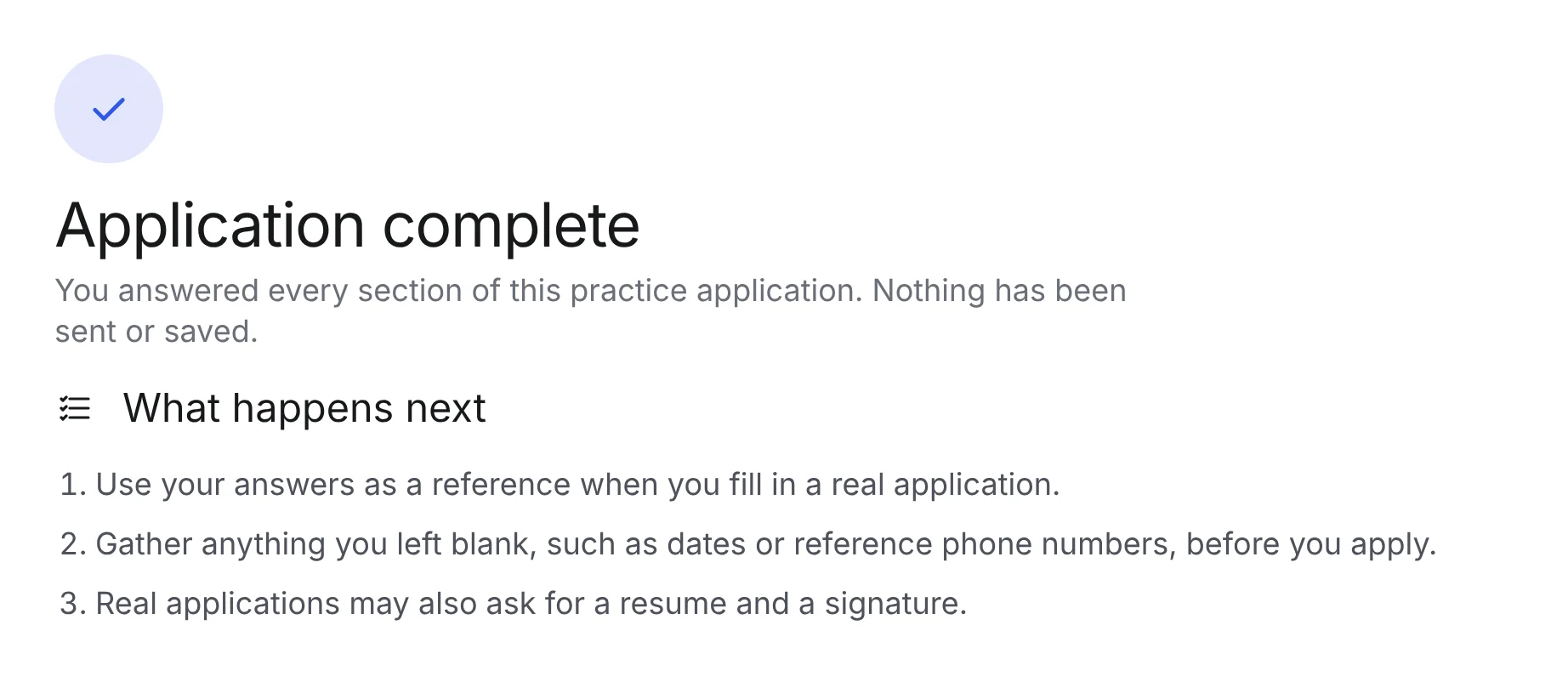
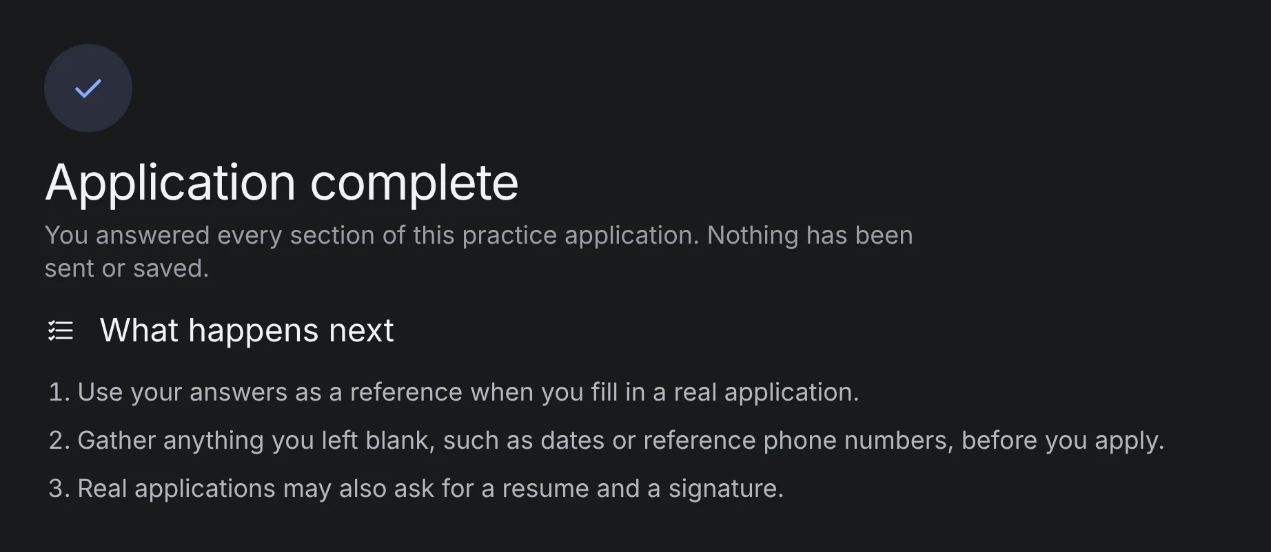
A clear ending. The result is the first thing a screen reader hears.
Every decision starts from something we saw or heard in the four sessions. Where the sessions didn’t settle a question, I used published research or accessibility standards. Anything that is my own call is labelled that way.
| Decision | Why | Basis |
|---|---|---|
| Month, Day and Year as three plain text boxes | None of the four participants could fill in the browser’s built-in date box or work out what format it wanted. | ObservedAll 4 participants: none could enter a date in the built-in box or tell what format it wanted |
| Standard radio buttons, checkboxes and dropdowns | These worked with every participant’s screen reader. The built-in date box was the one control that failed. | ObservedParticipants got through these controls without help; the date box was the only one that failed |
| A heading for every step and section; every field has a name | Participants moved by jumping from heading to heading and field to field. Missing headings and unnamed fields made them skip content or land on a box with no name. | Observed + WCAGParticipants jumped by heading (H key) and by field (F key). WCAG 1.3.1 Info and Relationships, 2.4.6 Headings and Labels |
| No pop-ups, auto-advance or surprise redirects | Our study’s recommendations name these as a cause of the screen reader’s position jumping without warning. | Our recommendation + WCAGWritten by our team after the sessions. WCAG 3.2.2 On Input: no change of page or focus without warning |
| A list of errors at the top that takes focus, plus a message next to each field | The original never said what was wrong. A published study with blind users found that an error list like this reduces input mistakes. | Research + WCAGBuzzi et al., 2016: an error summary cut input mistakes for blind users. WCAG 3.3.1 Error Identification |
| Follow-up questions appear only when they apply | The original shows every “If yes…” question to everyone, so screen-reader users hear questions that don’t apply to them. | My callParticipants had to listen to “If yes…” questions that didn’t apply to them |
| Focus moves to the new step’s heading; the step number is in the page title | Participants kept track of their progress in their heads. This tells them where they’ve landed and how far along they are. | My call + WCAGParticipants tracked their step in their heads. WCAG 2.4.2 Page Titled, 2.4.3 Focus Order |
| A review page with a Change link for each section | Participants went back and re-checked every answer by hand. The original has no review page. | Observed + WCAGParticipants re-read every answer by hand. WCAG 3.3.4 Error Prevention: let people review before submitting |
| “(optional)” written in words, never an asterisk | Screen readers read words exactly. An asterisk may be skipped or read out as “star”. | WCAG3.3.2 Labels or Instructions. An asterisk may be skipped or read as “star” |
| When an employer is added, focus moves to it and it’s announced | The page never changes without the screen reader saying so. | WCAG4.1.3 Status Messages, 2.4.3 Focus Order |
| Animation only shows what changed; it never moves focus | Turns off when the device is set to reduce motion, so it never gets in the way. | WCAG2.3.3 Animation from Interactions; follows the device’s reduce-motion setting |
Animation marks changes a sighted or low-vision user could otherwise miss. A screen-reader user gets the same information from focus or a spoken announcement. No animation moves focus, none repeats, and all of them turn off when reduced motion is on.
A summary drops in, then the same message appears beside every field it belongs to.
Screen reader“There are 9 problems. Enter today’s date, link…”
Choosing No unfolds the question that depends on it, directly below.
Screen reader“No, radio button, checked, 2 of 2.” The new question is next in reading order.
The new entry rises in with a brief ring around it.
Screen reader“Employer 2, heading level 3.” Then: “Employer 2 added.”
New content rises in and the current step in the progress bar moves forward.
Screen reader“Step 2 of 8: Eligibility, position and salary, heading level 1.”
An automated scan with axe-core against WCAG 2.1 A and AA found no violations on any of the 8 steps, including every error state. A scripted run of a complete application exercised every validation rule, the follow-up questions, adding and removing employers, and the review.
Automated checks only cover what code can detect. The next step is to test the redesign with VoiceOver and NVDA, then with blind screen-reader users on the same task as the original study, measuring independent completion, time on task and confidence.